This all too familiar scenario for many of us was just part of being a gamer in an era that didn’t have the convenience of the internet and smartphones to aid in your choice. And while it had its frustrations and obstacles, as we’ve all bought or rented an absolute dud that spoiled our weekend, (I’m looking at you Superman 64), there is something bittersweet and charming thinking back to this simple time, when all we really had was the box art.
But not all boxes were created equal.
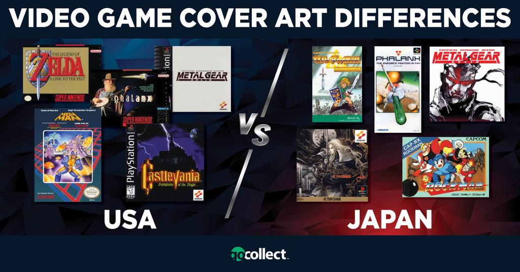
Cover art for video games varied greatly depending on the region it was being marketed in. Companies knew that each audience was very different in what appealed to them, and would tweak cover art accordingly to increase sales for that region.
Unfortunately, this usually meant the games released in the US had very bland covers compared to their Japanese covers due to what they thought the US audience would like. Of course, there are exceptions, and this will always be subjective and up to personal tastes, but more often than not, the US covers were quite basic in their design. Japan, on the other hand, had elaborate covers very much influenced by Anime, or featured hand-drawn art that fit with the tastes, styles, and what was popular in the region.
USA, who hadn’t embraced anime yet, nor this art style, went for a more minimalistic approach most of the time. In the PAL region, it was more of a mixed bag, with a combination of features of both the USA and Japan. PAL, sadly, didn't get access to certain games at all.
Below are some comparison images, USA releases on the left, and the Japanese releases on the right. Also, some PAL versions are included as well, just for fun.
USA - JAPAN
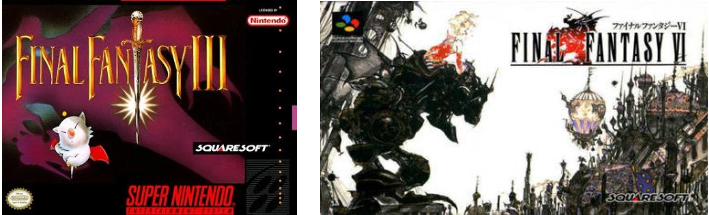
Final Fantasy III, also known as Final Fantasy VI in Japan because of how and when this series was released, had very different approaches.
The Japanese cover got amazing art done by the one and only Yoshitaka Amano, who is responsible for some of the most iconic characters in the entire series. The US, however, got a very bland cover, with just the title, generic sword, and a moogle. As cute as Mog the moogle is, the cover fails to capture the wonder and beauty of the Amano cover art featuring Terra and her Magitek armor.
USA - JAPAN
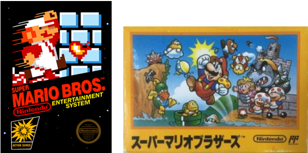
The godfather of gaming, Super Mario Bros., had a much different cover in Japan. The Japanese cover is filled with charm, personality, and style. Featuring many of the iconic characters we still know and love today.
In the US, Super Mario Bros. was part of the “Black Box Set”, which was a set of early released NES games that opted for plain black boxes, with minimal artwork, in this case, a sprite of Fire Flower Mario.
USA - JAPAN
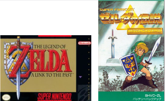
Zelda: A Link to the Past is one of the best games on the SNES and arguably one of the best games of all time. Japan chose to showcase Link in all of his glory, with the familiar blue and gold Hylian shield in hand and the iconic Master Sword in the background.
Meanwhile, the US cover kept the gold-colored theme that would be used in many more US Zelda titles and a version of the Master Sword and Hylian Shield that differs in appearance from how it normally appears. The colors of the shield are different, and the Master Sword has minor changes to the hilt.
USA - JAPAN
Castlevania is one the most well-known franchises in all of gaming, featuring the Belmont vampire hunter family and the big baddie himself, Dracula. The earlier titles in the series on the NES, SNES, and PCengine, did have really nice looking cover art in the US, frequently resembling work by Frank Frazetta and the Conan series.
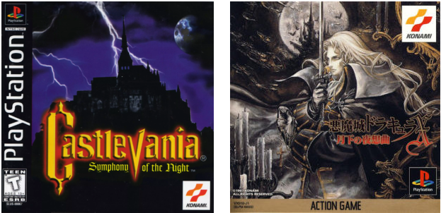
For this PS1 release, however, they went for a very uninspired and basic cover, which was common for PS1 in the US. A dark castle in the background with a few lightning bolts and the title. Japan, however, went full tilt into the more stylized approach and got artist Ayami Kojima to illustrate her take on the main character Alucard.
Alucard is drawn with such detail. Sword in one hand, cross in the other, white hair flowing in the wind with Dracula’s castle and the moon ominously pictured in the background.
USA - JAPAN
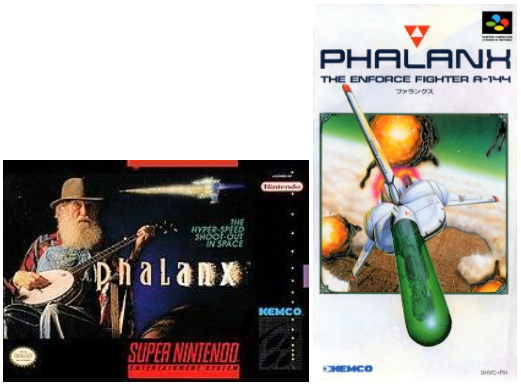
O boy, this cover really speaks for itself here and is well renowned in the video game scene for its absurdity.
Phalanx is your typical Space Shoot 'em up, so it makes perfect sense that the Japanese cover features the spaceship you control. However, the US cover took a very different approach. Because nothing says space shooter like an older gentleman playing a banjo, am I right?
USA - PAL - JAPAN
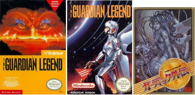
Guardian Legend is a unique game for the NES/Famicom in that it features many similarities to The Legend of Zelda and Metroid, but also has shoot 'em up sections. A mixture that is not very common, even today. Each region got a completely different design for the cover as well. The PAL cover features the “Guardian” character that you control in an anime aesthetic.
The Japanese cover has what can be best described as a love letter to H.R. Giger, with many similarities to the Alien franchise, Xenomorph, and the Species franchise, Sil.
In the US, the cover is far less elaborate and detailed, with just a glaring pair of eyes in the horizon, with the title taking up much of the cover. Not a bad cover by any means, but being an H.R. Giger fan, the Japanese cover really stands out to me. Seeing the PAL or Japanese covers would have absolutely swayed me into purchasing them.
USA - JAPAN
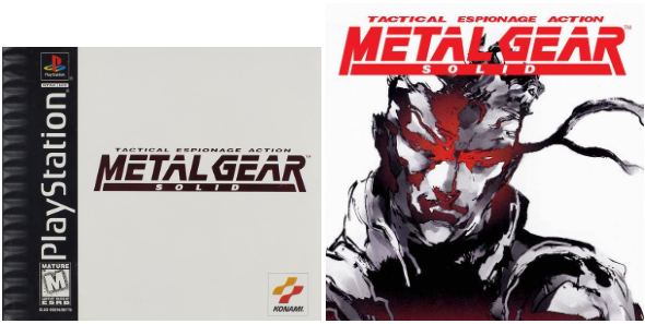
Metal Gear Solid was many gamers’ first experience with the long-running series created by superstar, Hideo Kojima. Stealth gameplay wasn’t new, but this game launched the series and genre into the stratosphere, with Kojima opting for a stylized cinematic approach not common at the time.
For a game that has so much character, you would think the US cover would have reflected at least some of it. And while the US cover is still simplistically beautiful in its own way, with its plain snow-white background and red metallic foil title. It lacked the character and iconic artwork of Yoji Shinkawa that the Japanese cover had, who has an unmistakable identity in his art and characters.
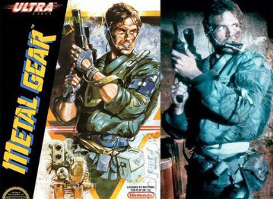
Fun Fact: Metal Gear 1 on the NES/Famicom actually features a direct copy of Kyle Reese from the Terminator series, down to the very last detail.
USA - JAPAN
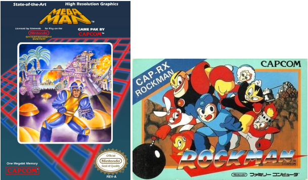
Similar to Phalanx, this is another renowned video game cover, for just how silly it is, not to mention - inaccurate. Mega Man is one of the most familiar faces in the industry, and the Mega Man series is still going strong today.
This was the first game in the series, so it was important to illustrate the blue bomber in the most appealing way possible, which, thanks to the source material, should have been an easy task.
He’s a blue robot boy, has an interchangeable cannon for an arm, and fights other unique robots with powers of their own. A character design and recipe that was bound to hook kids all over. Somehow that translated in the US to drawing a constipated-looking gentleman in a weird-looking loose jumpsuit, with a gun in his hand.
USA - JAPAN
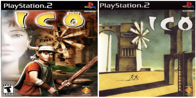
Ico - Another US cover where they went for the bold, in-your-face cover art. Displaying the 2 main characters, hoping the horned figure would appeal to the audience. In contrast, you have the Japanese cover art that almost looks like a painting. Incredibly minimalist, with just some basic architecture that still somehow pulls you in.
The 2 characters are so small, you can barely make out what they look like. Because this game was so much more than just its horned protagonist. It was another game that tried to blur the lines between art and video games, and it did it quite well.
An interesting bit is that the Japanese cover was actually drawn by the Director, Ueda Fumito. Talk about putting your own personal touch on your project.
USA - JAPAN
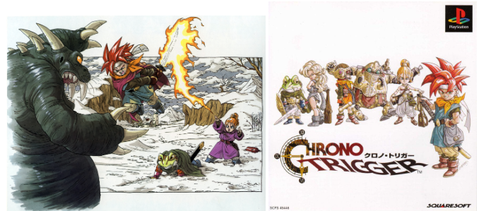
I saved the best for last. Chrono Trigger. My favorite game of all time, and a game where I actually think the US box art shines just a bit brighter. I still love and appreciate the minimalistic approach to the Japanese cover.
All the playable characters are present and accounted for, and the art style by Akira Toriyama is unmistakable. It is as Japanese of a game cover art as can be. But there is something special about seeing these wonderful characters in action, fighting a boss that actually exists in the game, and using one of the many Dual Techs that you can learn.
It’s not all positive though. There are actually 2 pretty big errors on the US cover. Marle, the person casting the fire spell, doesn’t use fire at all and uses Water magic. Lucca, not pictured, is the Fire elemental. And this battle in the game doesn’t take place in a snowy field, but instead in a dark and watery cave.
Flaws and all, I just can’t help but smile when I see this cover and be reminded of the very moment I saw it and brought my own copy home. And that is the magic of what cover art encapsulates for so many of us. Our first glimpses into the worlds we would become so engrossed in.
The first impressions of the worlds and characters
that would stick with us for decades to come