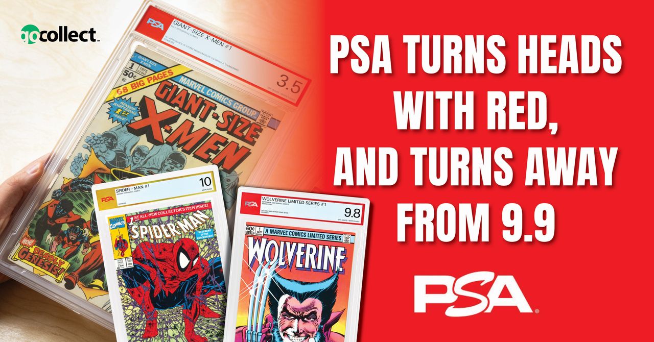
At this point, it doesn’t even matter whether you’re a fan of grading or not. Anyone who collects comics—and likely their younger, pack-ripping siblings who don't—knows PSA is about to strut into a brand-new scene. This is the ripple effect of a Goliath taking a step. The water in the glass is vibrating now. PSA isn’t just entering the hobby—they're arriving like a collector-class Kaiju with the potential to reshape the entire landscape.
And from what I can gather, comic collectors are ready for it. Maybe a little too ready. Like a blockbuster movie trailer that hits a little too early, the rollout of this moment started to feel like it was being pushed back... and then delayed again. But the delay wasn’t arbitrary. We asked for it. We collectively—and almost comically—held that giant foot in the air and told PSA to walk it back, redraw the slab, and come correct before we’d let it land on our side of the fence.
Over the past 10+ months, while PSA was in their corner crafting what’s revealed to the world today, the conversation around PSA entering the comic hobby matured into a full-blown what's-hot-and-what’s-not surrounding the inconsistencies of comic grading and the companies that offer it.
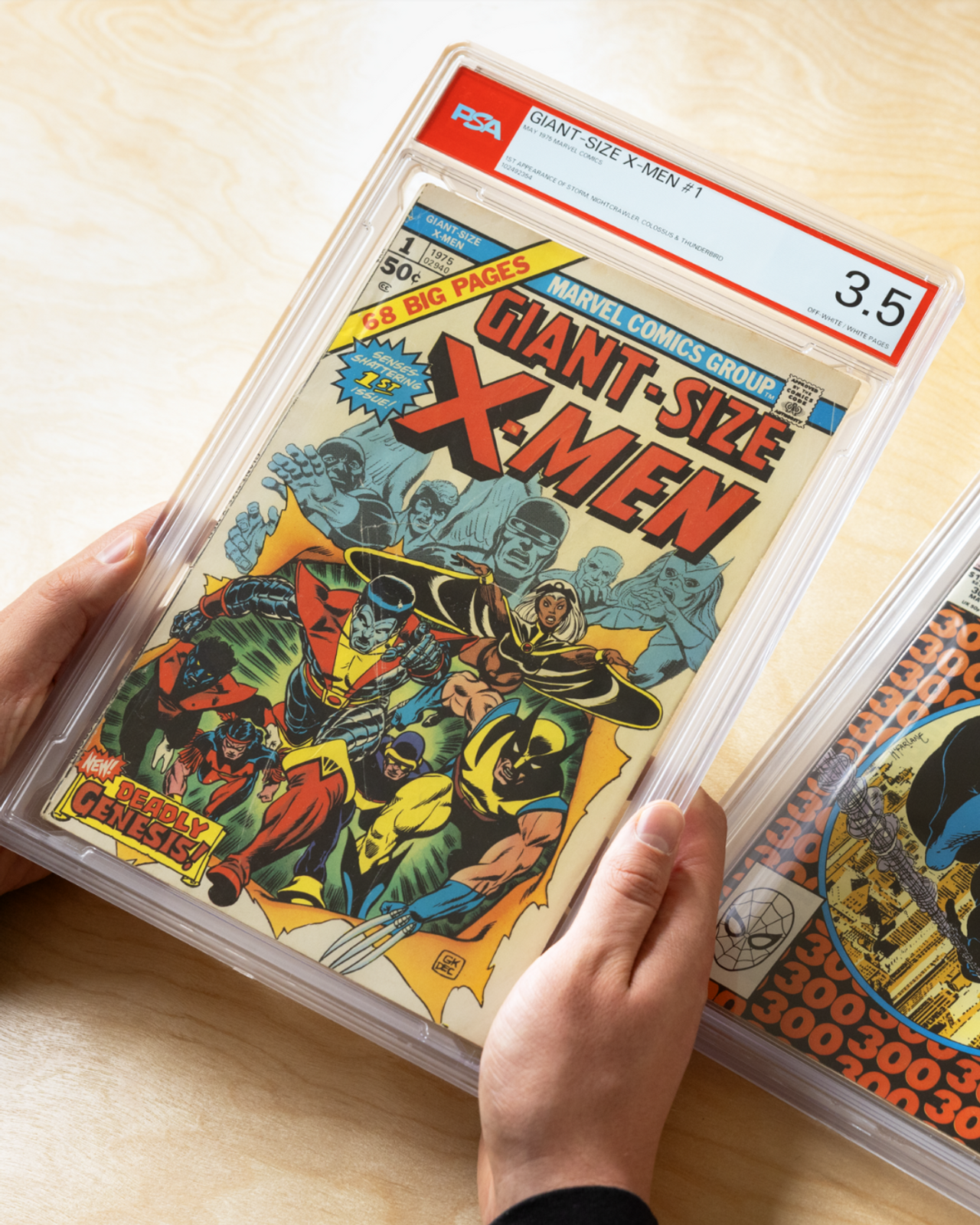
If nothing else, it's clear now that the engineers and thinkers who designed today's release had two eyes fixed on the drawing board and both ears tuned to the crowd noise. Take a look below at the new face of comic book collecting, and wrap your head around the unique options coming for authenticating, recognizing, preserving, and displaying your collectible literature.
"It's Slabberin' Time"
Or, is it still clobberin’ time? Something tells me there won't be nearly as much backlash on this design as there was with the original. Take a good look and let us know what you think in the comments.
As for me, I stared at this for a long time up close. Then I zoomed out and stared some more. Only once I got past the obvious branding changes and what I expected to see on the left vs. the right, I found that this design carries a clean and simple message that (to me) does a service to the presentation of the actual item contained within—and that message is: present relevant information clearly and efficiently, offer a subtle brand signature, and then get out of the way. This is, after all, about the book. The label stops at the mouth. The slab construction, however, continues all the way down.
Additional details released on the construction of the holder are as follows:
99.9% UV reflective
holders are extremely tamper-evident, with top and bottom pieces that overlap around the edges, making it incredibly difficult to open without leaving evidence such as frosting or cracking
PSA engineers chose polycarbonate for their holders. With a history in aerospace applications, eyeglass lenses, and bulletproof windows, it’s nearly unbreakable—boasting an impact strength 250 times that of glass, and 30 times that of acrylic sheets. While other holders are prone to cracking or shattering, these new holders provide superior durability and resistance to chips and fractures
Extremely resistant to water, heat, and cold
Like their card holders, comic/magazine holders are stackable for easy storage
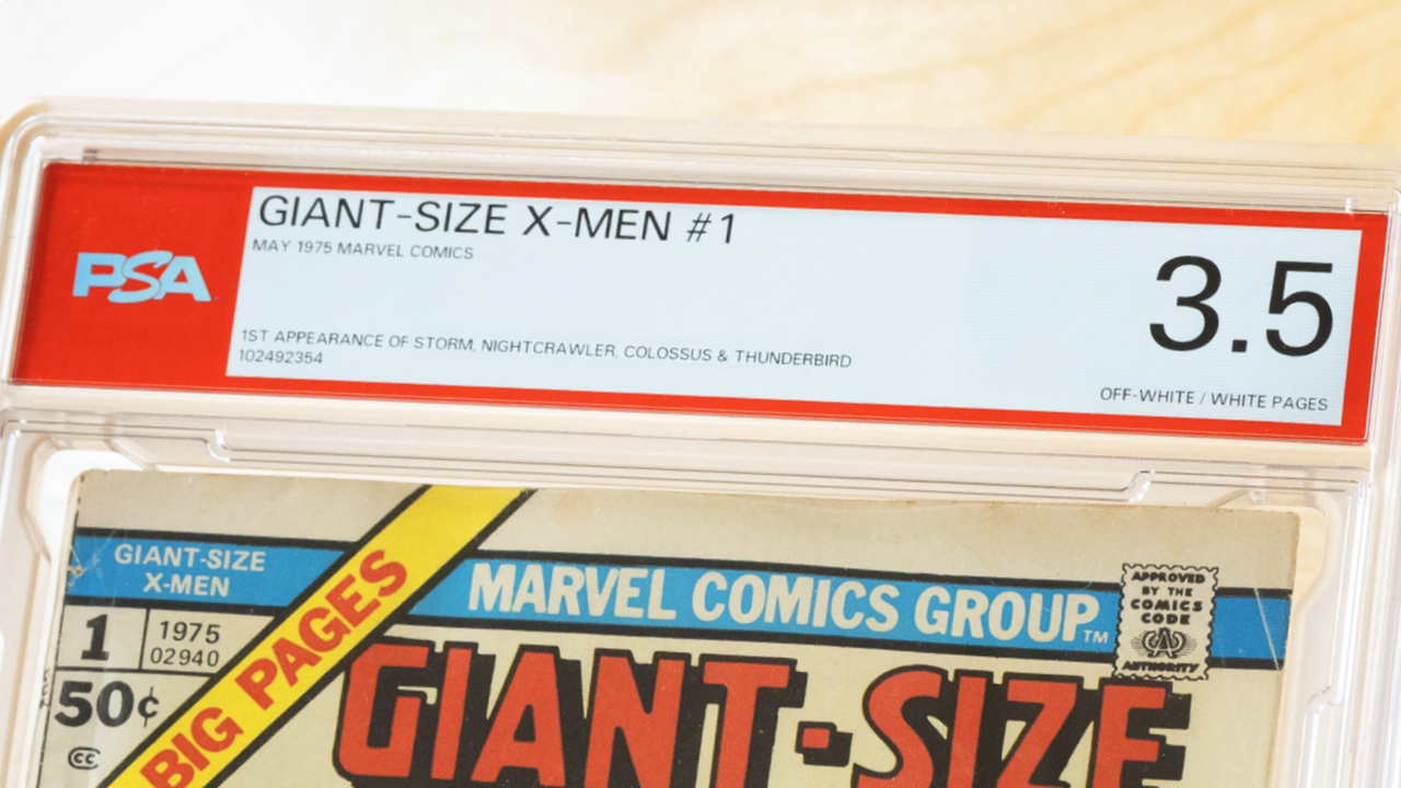
And here it is again in the wild—on a comic you’ve probably seen more than a few times.
I’m enjoying the contrast between the sleek and stylized PSA logo on the left and the simplified font of the grade on the right. I’m into the way all the sizes blend and balance across the label. I can read it. I can grasp the significance almost immediately. However, I didn't see any artist contributions listed on the labels released so far. I was curious if that information had been moved to the back of the slab, so I reached out to PSA to confirm, and ask if they would send me over a picture of the back of the slab.
While I wasn't able to secure an image of the back of the slab design to show off today, I was able to get confirmation that all artist, author, and contributor credits can be found on the back of the comic or magazine label.
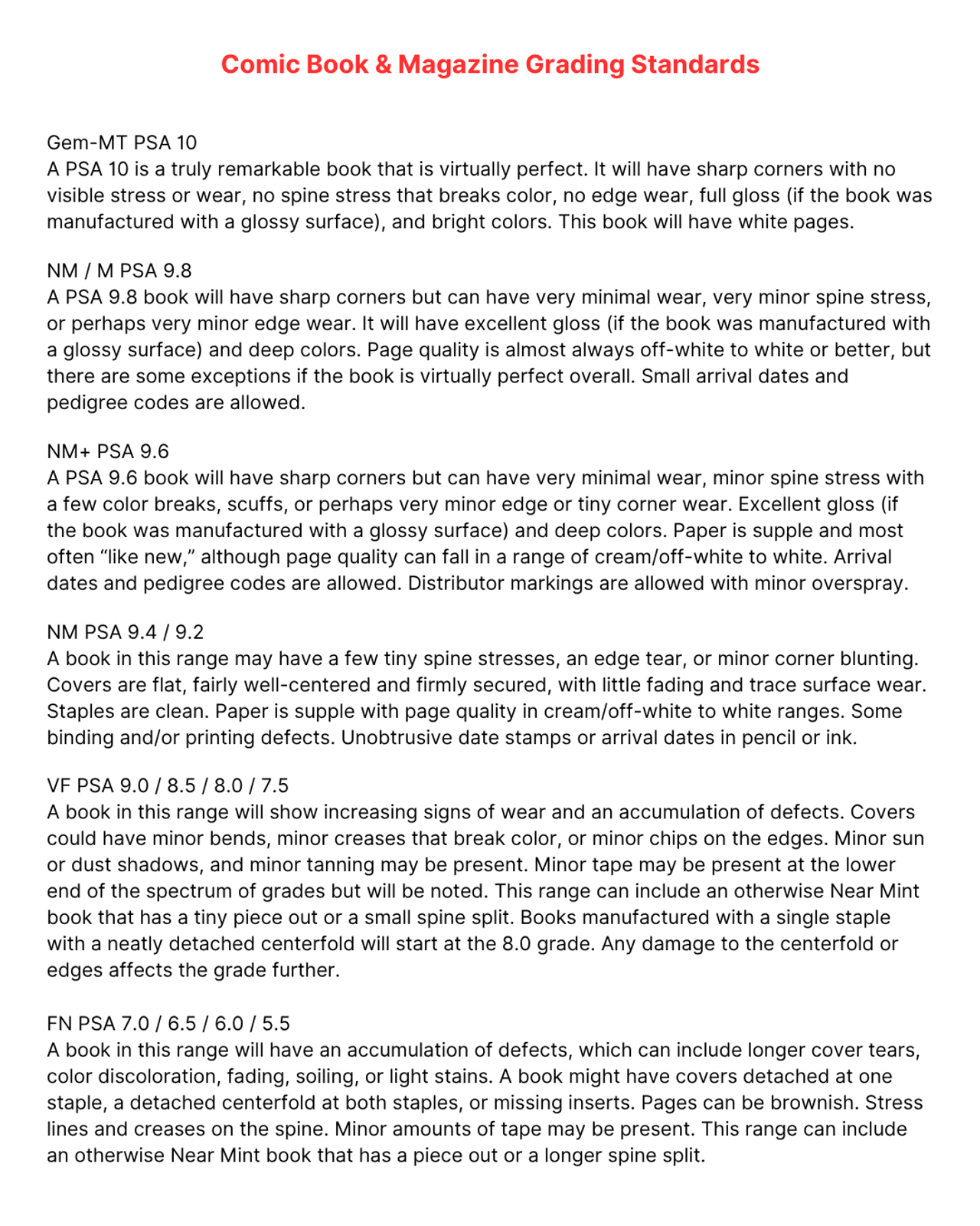
As I remain curious to what that will look like, we need to move on to another major aspect of this launch. I've been chomping at the bit for days to highlight a small but hugely important gap PSA is introducing at the very top of their grading scale—subtly adjusting a standard we're coming to know, coming to hunt, and sometimes even to revere. Here is what PSA has released as their upcoming grading standards:
"9.9, We Hardly Knew Ye"
We're going to stop the scale right there. The bottom isn’t what matters.
Did you catch what I did at the top? Or rather, what I didn’t? This tiny omission between 9.8 and 10.0 is, in my opinion, more newsworthy than the slab release itself. Because it has—even more than the label design—the potential to significantly mold the landscape from the very beginning of PSA’s entry into comics and magazines.
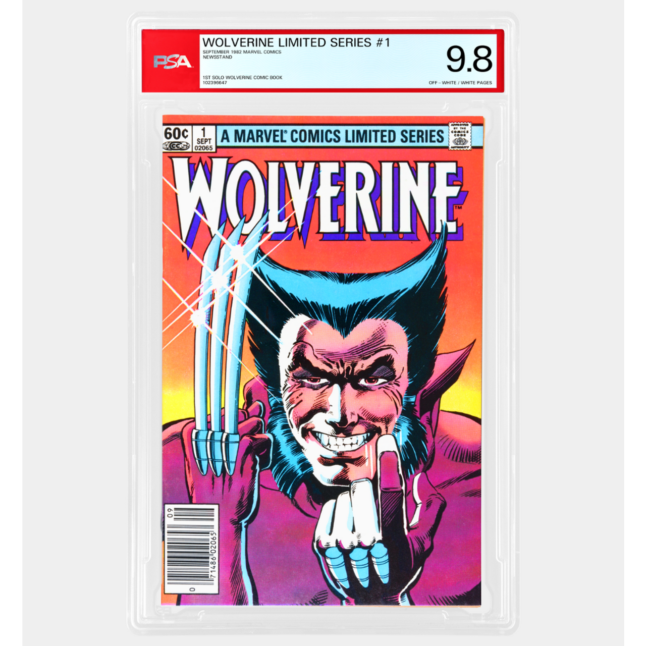
The missing 9.9… hang on. Actually, let’s not call it "missing." It’s not an oversight—it’s a deliberate decision. PSA has purposefully chosen not to include a 9.9. The only reasoning I can gather behind this move is that it creates a sharper distinction between the top two achievable grades. A 10.0 is—and always will be—virtually perfect. No flaws. Case closed. That means a 9.8 is launching with the necessary breathing room to contain one small imperfection. Perhaps a barely blunted corner or a faint bit of edge wear. A minor spine tick. That’s what a 9.8 will represent under these standards.
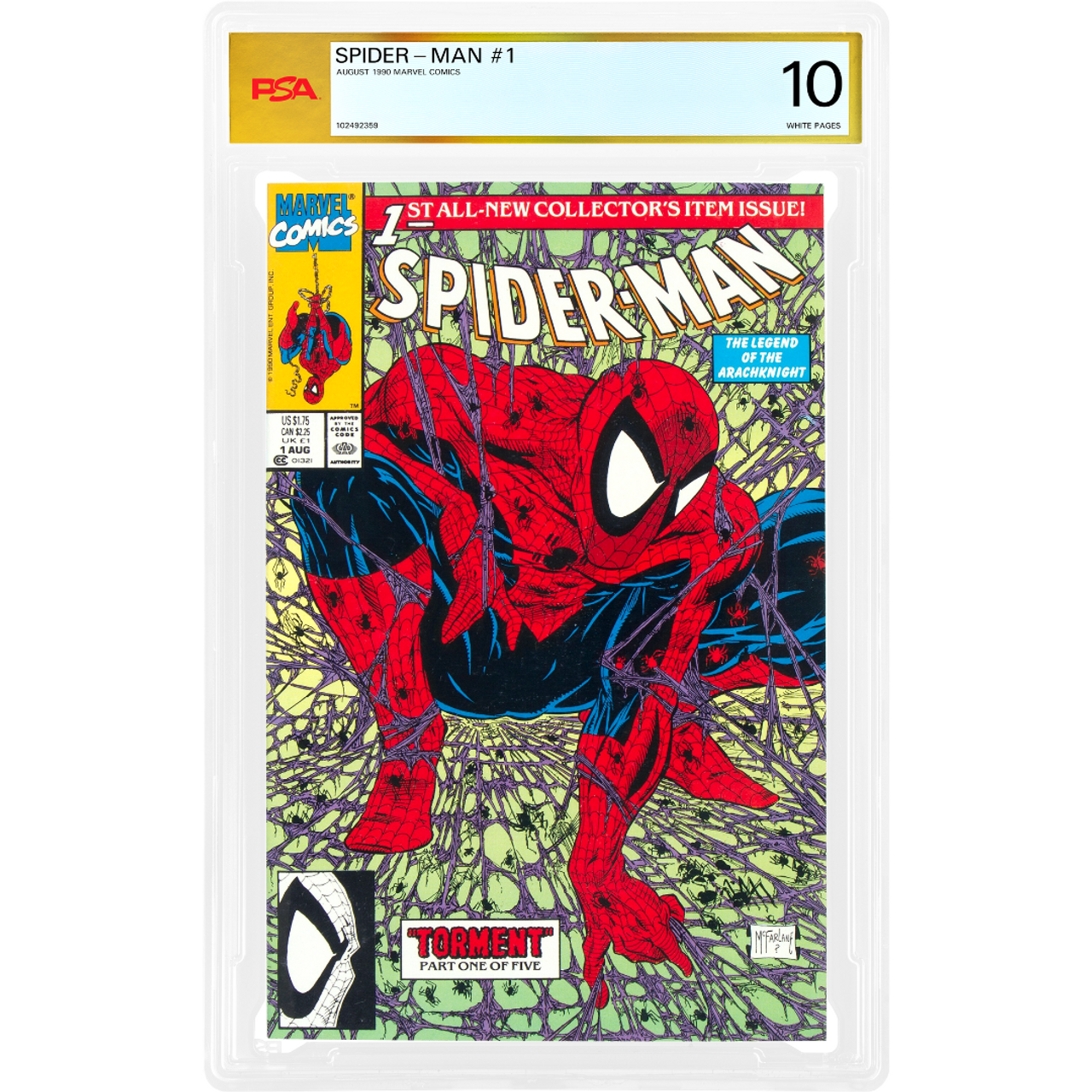
The unblemished 10.0 represents this:
Here at GoCollect, a conversation is already in full swing about the creative potential PSA’s grading structure unlocks. Not having a 9.9 essentially means we’ll need to develop better tools to compare and contrast the value-in-condition differences between grading companies and the scores they assign to your collectibles. To us, that sounds a lot more exciting than just sticking to the same old scale. As with any new system, we’ll have to watch how it all unfolds over time.
With GoCollect integrating PSA sales from the very beginning, we are going to have a lot of fun breaking down these exciting new numbers.
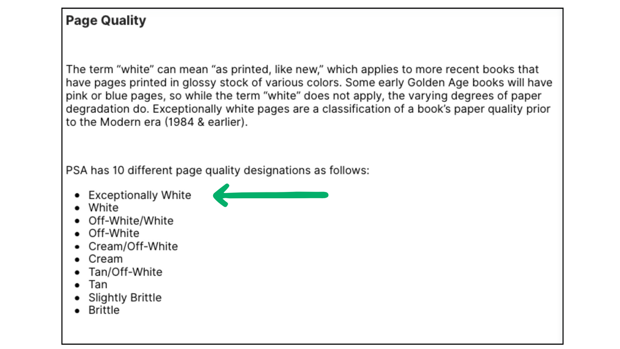
Before I let you go, there’s one more addition to PSA’s grading standards that deserves a shout: In this fresh, supple new world PSA is crafting, Exceptionally White pages also await you.
This kind of move happens when more eyes are on the details. Seasoned collectors will appreciate it, because these distinctions already exist in the deep-end conversations we’re having privately. If you've got a book that’s 40, 50, even 60+ years old, and it still has truly white pages? That’s not just nice... that’s exceptional.
I, for one, won’t mind seeing those words on some of the early submissions I was fortunate enough to be involved with through PSA. That’s right—I have my first submissions en route to PSA facilities as we speak. Off to be pressed, cleaned, slabbed, and returned for another round of careful, appreciative, PSA scrutiny.
That submission includes five books, three of which are magazine-sized, each selected with a specific purpose in mind. I wanted to challenge PSA’s grading at the top end, using rare, high-condition examples of larger-format comics. Some have thick spines and painted covers. Some are flat and flush with gloss. Also among them is my copy of Fantastic Four #48 which—depending on the day, and who you ask—floats somewhere between a 6.0 and an 8.5. That kind of grade variance is exactly what I’m eager to see PSA weigh in on. Naturally, I also considered presentation. Every book I sent was chosen with the intent of letting PSA’s branding and design do some visual heavy lifting. I want those slabs to stand out.
Whatever comes back, it’ll tell me a lot. Not just about grades—but about how this next chapter in comic preservation might actually read.
